Why AI ads look fake: a frame-by-frame failure atlas
Sixteen named tells, sorted by the part of you that catches each one: your body, your memory, your eye, your reading, your ear, your sense of story. Each with the symptom, the cause, and the fix.
What is in here
Resolution is not the axis. AI ads read as fake because of behavior: objects perform events they could not perform, layers shear against each other at false depth, motion is real but invisible at feed size, type dissolves at 360 pixels, sound arrives late, and the film answers a question it never asked. Six different parts of a viewer catch these, and each catches a different class of error. Almost none of them are fixed by a better model.
- Sixteen named tells, each with the frame-level symptom that gives it away
- The four kills that wrote our own rules, told as what actually happened
- Why a set of ads can pass every individual check and still read as one ad
- A scored diagnostic you can run on a cut you already have
Four numbers from our own production log
Ours, counted off delivered files01Why do AI ads look fake even when the resolution is high?
Because resolution is not what you are catching. You are catching behavior. A 4K frame of a bottle pouring wrong is more obviously wrong than a 720p one, because there is more evidence in it. Every tell below survives a resolution bump, and a few of them get worse.
This matters for what you do next. If you think the problem is fidelity, you upgrade the model and wait. If you know the problem is behavior, you change what you ask the model to do, or you change which shot carries the moment. One of those costs a subscription. The other costs an afternoon and works.
Five things people say about the AI look, and what we found instead
Flip them02Six organs, sixteen tells
Sorting the tells by what they look like produces a list nobody can use. Sorting them by which part of a viewer catches them produces a triage. Physics is caught by the body, before thought. Continuity is caught by memory, one shot later. Composition is caught by the eye. Type is caught by reading. Sound is caught by the ear, usually as a reason to leave. Story is caught by the mind, and always too late to save the ad.
The order the six organs fire in
The shape of itThe atlas: sixteen tells, filed by the organ that catches them
Search the atlasThe impossible eventPhysics
Weightless contactPhysics
The free-floating shadowPhysics
Spring and overshootPhysics
Sheared parallaxContinuity
Per-render driftContinuity
The cut inside the shotContinuity
Hidden animationComposition
Everything moves, nothing changesComposition
Photo plus typographyComposition
The sub-pixel stemType
The scrim rampType
The silent first frameSound
Treble as textureSound
The leaked payoffStory
The shuffleable filmStory
Two things follow from sorting them this way. The organs fire in order, so a physics failure spends the viewer before a story failure ever gets its turn. And they cost different amounts to repair: the body-level ones need the shot generated again, while the eye-level and reading-level ones are usually a rebuild of the last twenty minutes.
03Physics: one kill wrote the law
We built a shot of a photographed loaf pulling apart into two halves. Properly masked, color matched, grounded with a shadow derived from the element's own alpha. It cleared every automated check the engine had, because nothing in the engine knew what bread does. It was killed on sight, and the reason had nothing to do with craft.
Masahiro Mori's essay on the uncanny valley, translated for IEEE Spectrum, makes the argument that has held up best here: a near-miss reads worse than an obvious miss. A drawn hand asks nothing of you. A photographic hand with one wrong knuckle asks you to accept a person and then breaks the contract. Generated footage lives in that valley by construction, which is why small errors cost so much more than they look like they should.
That is not really how two pieces of bread separate.
The entire verdict on a shot that passed every automated check we owned
The crumb-pull, in the order it happened
Step through the incidentTwo halves of a loaf, cut out and pulled apart
Masked cleanly, color matched to the plate, grounded with a shadow derived from the element's own alpha rather than drawn by hand. On a still frame it was genuinely good.
Cost of a change here: minutesEvery gate green
Contrast, dwell, full bleed, occlusion budget. All of them measure the frame. None of them measure the event, because an event is a claim about the world and a frame is only pixels.
Cost of a change here: minutesThree words, and the shot was gone
A photograph has one state. Asking it to perform an event forces the compositor to invent geometry the camera never recorded: a new crumb structure, a new torn edge, a new interior.
The eye reads the invention immediately, and cannot say what it read. That is the whole mechanism.
Cost of the change here: the shotThe exception we had to add
A declared, obviously designed treatment may do the thing. A papercut split, a drawn tear, a cutout that behaves like an illustration. It never claims to be real, so nothing is being faked.
The kill is faked realism, not motion. We got that wrong for a while and banned too much.
What a still is allowed to do
Push, settle, drift, and a light patch traveling across the surface. It behaves like a card, not like the object it depicts. Physical events come from real footage or from true video generation.
04Why do all AI ads look the same?
Because sameness lives on axes nobody measures. Cut rhythm, transitions, type and music are easy to vary and easy to count, so they get varied. Argument, subject, world, energy, point of view and borrowed genre are hard to count, so they stay fixed, and those are the six a viewer actually sees.
We retired eight finished ads in one go over exactly this: they differed on every mechanical axis and were identical on all six perceptual ones. The whole account of that set, and what it takes to build ads that do not wear out together, is in what makes an ad resist fatigue.
What our old quality check measured, and what a stranger sees
Compare| Dimension | Our old lint measured it | A stranger sees it |
|---|---|---|
| Cut rhythm | Yes. Yes | No. Not as difference |
| Transition palette | Yes. Yes | No. Not as difference |
| Type treatment | Yes. Yes | No. Not as difference |
| Music and tempo | Yes. Yes | No. Not as difference |
| The argument the ad makes | No. No | Yes. Instantly |
| Who or what is on screen | No. No | Yes. Instantly |
| The world it happens in | No. No | Yes. Instantly |
| Its energy | No. No | Yes. Instantly |
| Point of view | No. No | Yes. Instantly |
| The genre it borrows | No. No | Yes. Instantly |
Sameness is the failure a maker is least able to see, because you built each one separately and remember the differences. A viewer meets the set at once and remembers nothing. There is more on how this happens shot to shot in per-render drift and brand consistency.
05Type and sound are the two tells you can measure
Most of this atlas is judgement. Two entries are not. Text legibility and first-sound timing are both numbers, and both are checkable on a delivered file in about a minute. We re-measured fifteen static ads we had already sent, rebuilt byte-identical, this time reading perceptual contrast against the worst local background under each glyph run instead of a mean, and again at 360 pixels.
A legibility re-measure of fifteen delivered statics
The numbersSee the numbers as a table
| What we re-measured | Failed | Passed |
|---|---|---|
| Delivered cards | 14 | 1 |
| Text runs inside them | 60 | 18 |
Two patterns accounted for nearly all of it: pale display type over a photograph with a soft gradient scrim, and small letterspaced caps. The one card that passed was the only one that did not put type over a photograph. The failure was the house style, not one card, which is the only version of this finding worth having. More on the floors in legibility floors on a phone.
Four of our own statics, and what stops each being a photo with words on it
Ours, made this way06How do I check a cut for all of this in five minutes?
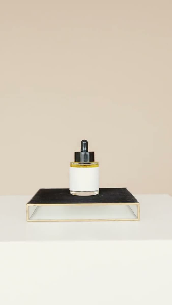
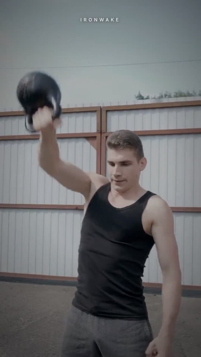
Watch it cold, on a phone, with sound, at arm's length, once. Then watch it again and only look at the places two things touch. Contact is where physics is decided, and it is the fastest read in the frame. Everything else can wait for a second pass.
Four frames from our own work, and what we check in each
Scroll it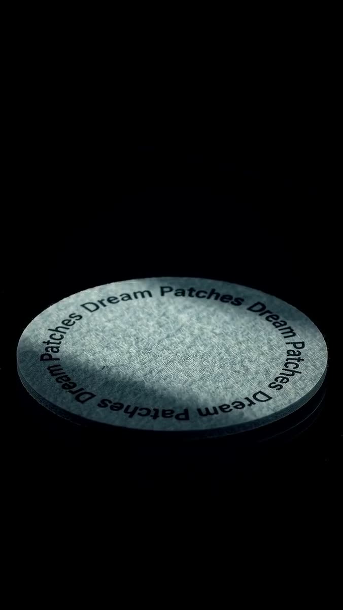

Where the object meets its own reflection
A reflective ground is the cheapest lie detector there is. The reflection has to agree with the object about position, angle and softness, and it has to fade at the rate the surface roughness implies. If the object drifts and the reflection does not follow at the same rate, you have two layers, not one scene.
Where the object meets the surface
Look for two shadows of different softness: a tight, darker one right at the contact, and a wider ambient one further out. A single soft blob under the whole object is the pasted-on look. The offset should scale with the object's own width rather than sit at a fixed number of pixels, which is why the same shadow recipe looks wrong when you change the size of the thing.
Where the shadows disagree with the sun
One sun, one shadow direction, one shadow length ratio across the whole frame. Generated environments break this quietly: a parasol that shades nothing, a lounger whose shadow points a few degrees off its neighbor's. Also check that the water distorts what is under it and reflects what is above it, in the same shot.
Where mass is being claimed
A heavy object bends the person holding it. Look at the wrist, the shoulder and the opposite hip, not at the object. If the body would look the same holding nothing, the weight is a costume. This one is a favorite of ours because it is the tell you can check on a still, and almost nobody does.
The motion nobody could see
A set of our films carried image animation that was, in the delivered file, covered by black type plates. The motion was real, it cost money, and at feed size it was invisible. The verdict was that viewers would read it as a mistake rather than as restraint, and that is right. A viewer cannot tell subtle from broken.
What we animated, against what the viewer received
Second by secondRead it as a list
| At | Channel | What happens |
|---|---|---|
| 0.0s | Built | Plate settles in |
| 2.4s | Built | Light travels across the pack |
| 5.2s | Built | Slow drift up |
| 0.0s | Delivered at 360px | Type plate over all of it. Nothing perceptible. |
Invisible animation is worse than none.
The rule we wrote after paying to render motion nobody could see
07Every detector we built was confidently wrong
Every automated substitute for judgment we have built has failed toward a confident wrong answer. Four detectors, five limb measurers, a cut counter wrong by nine times in one direction, and a frame-delta gate that ranked our accepted films below our rejected ones and was withdrawn. The numbers behind that last one sit with the hook rate and hold rate benchmarks.
Which organ is catching your ad?
Score yourselfOne limit runs under the whole atlas: not one film in the reference set carries a hook rate or a return on spend, so every tell here is a judgment about what breaks rather than a measurement of what converts.
There is no public field guide for video tells the way Wikipedia's editors built one for AI writing. That absence is most of the reason this page exists, and it is also a reason to argue with it. Sixteen is what we have written down so far, not a closed set, and the two we are least sure about are both in the composition row.
Questions people actually ask
Open what you needWhy do my AI ads look fake?
Almost always because of behavior rather than fidelity. Something in the frame does what it could not do: an object performs an event, a shadow floats free of its object, two layers shear apart at false depth, or a product changes slightly between shots. Watch your ad twice, and on the second pass look only at the places two things touch. That is where the eye is already looking.
Why do AI generated videos look fake even when the resolution is high?
Resolution adds evidence, it does not add correctness. A high-resolution frame of a hand holding a bottle wrong shows you more of the wrongness.
The tells that survive a resolution bump are all relational: contact, shadow, occlusion order, scale, continuity between shots. None of them is a property of one pixel, so no pixel count fixes them.
Why do all AI ads look the same?
Because the axes that are easy to vary are not the axes a viewer perceives. Cut rhythm, transitions, type and music are countable, so they get varied. Argument, subject, world, energy, point of view and borrowed genre are not countable, so they stay fixed, and those are the six that a stranger reads instantly. Vary the argument and the film stops belonging to the set.
What makes AI UGC ads look realistic?
Real contact and an ordinary performance. Hands on real objects, expression that has a cause in the frame, and a camera position that a person could have held. The register is set by audio more than picture: speech with gaps reads as a person talking, scripted voiceover with no gaps reads as a brand film. There is a whole piece on the hardest version of this, hands, products and the contact problem.
Is AI slop a real thing, or just a complaint?
It is a real and specific thing, and it is not the same as low quality. The complaint people are making is about the absence of a decision: work that could have been made about anything, for anyone, and shows no evidence that a person chose one thing over another. That is why volume alone reads as slop even when each individual asset is clean.
Can I fix these tells in post, or do I have to re-generate?
Appearance is fixable in post. Behavior is not. Grade, grain, crop, speed and sound can all be repaired after the fact. Contact, deformation, occlusion order and depth are baked into the pixels and need the shot made again. We wrote the full test battery for this at what video models still break.
A stranger catches a fake ad by noticing that nothing in the frame had to be decided by anyone. Every tell in this atlas is a decision that was left to a machine, and the fix in every case is to make it yourself, on paper, before anything renders.
Where the numbers came from
- IEEE Spectrum. The Uncanny Valley (Masahiro Mori, translated by MacDorman and Kageki) - the original argument that a near-miss reads worse than an obvious miss
- W3C. Understanding Success Criterion 1.4.3: Contrast (Minimum) - the 4.5:1 and 3:1 ratios our own legibility gate is built on
- Wikipedia. Signs of AI writing (community guideline) - the public field guide to AI tells in prose. Nothing equivalent exists for video, which is why we wrote this one
Every figure above links to the place it was published. Numbers marked as ours are measured inside this studio and we say so where they appear. We do not print a statistic we cannot point at.
Send a link. Get one finished ad back.
One finished cut built from your own product, inside three days, free and yours to run whether or not we ever work together. Run it against the sixteen tells on this page. If any of them show up, you will know we did not follow our own atlas.
Replies within a day. Ad within three.