The beauty ad everyone has already seen
You can already picture it. Window light from the left, a stone slab, one slow drop, a serif in the corner. Here is why the whole category landed there, why a generator makes it worse, and seven things a beauty brand can do instead.
What is in here
Beauty ads converged because every one of them is briefed against the last approved beauty ad, and because the safest image in a category is the one that has already been signed off. A generator makes it worse for a mechanical reason: the likeliest picture in a category is its average, and an average is what you get. The way out is not weirdness. It is picking a different register, a different camera position, and a different thing to point at.
- The exact ad you can already picture, described closely enough to be useful
- Why convergence happens, and the one reason a model amplifies it
- Seven alternatives with what each actually costs to make
- Our own sameness audit, including the set of eight ads we had to retire
Here it is. Soft window light from the left, slightly cool. A honed stone slab standing in for marble. One bottle, amber or frosted, turned three-quarters on. A hand comes in from the right and rotates it maybe fifteen degrees. A drop of something clear runs down the glass, slower than a real drop would. Serif type fades up in a corner, letterspaced, probably ivory. There is a piano.
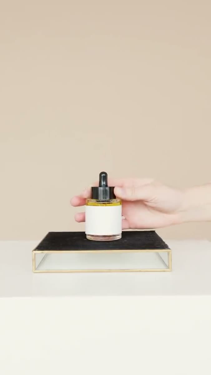
01Why do all skincare ads look the same?
Because the category grades its own homework. A new beauty ad gets briefed against the last beauty ad that performed, approved by people who watch the same reference reels, and shot on the same rented surfaces. Convergence is not laziness. It is what happens when everybody optimizes against one reference set.
The second force is about risk, not taste. The stone-and-droplet ad has already been approved somewhere. Nobody was ever fired for it. And in a category where the claim is legally constrained, the picture is the only place left to be safe.
Which of these is in the last beauty ad you scrolled past?
These percentages are an illustrative split, not survey data. The interesting part of the question is that most people can answer it about an ad they never actually watched.
The cost is arithmetic rather than aesthetic. If your ad is interchangeable with four competitors in the same feed, you may be paying to build recognition that lands on whichever brand the viewer already knew. That is the distinctiveness argument, not a measurement of your account. Motion, across more than 550,000 ads, found roughly half of all creatives switched off before day 28. That clock starts early on an ad that was never distinct, which is the subject of why some ads resist fatigue.
Four things beauty brands tell us, and what we found instead
Flip them02The sameness audit: eight ads that were one ad
We found this in our own work before we found it in anybody else's. Eight finished ads went out and came back retired in a single afternoon. On paper they were different: different cut rhythms, different transitions, different type, different music. Every variable a maker controls had been varied. To a viewer they were the same ad eight times.
It had happened before at a bigger scale and we missed it then too. Twenty films shared one skeleton. The verdict in our own notes was three words: one ad, twenty times.
What the audit actually counted
From our own logThe fix was to throw away the check we had. It measured editing mechanics, which is exactly the layer where those eight ads differed. What replaced it measures perception: six axes a viewer registers, with a hard cap of two matches between any two pieces in a set. Applied backwards to the eight, they matched on all six.
What a viewer perceives, and where beauty ads collide
The six axes| Dimension | What the axis means | The beauty default |
|---|---|---|
| Argument | The one thing the ad asserts | This will make you look better, said gently |
| Subject | Who or what the film is about | A bottle on a surface, or a face at eye level |
| World | The place it happens in | A bathroom nobody lives in, or a studio pretending to be one |
| Energy | Its tempo and its temperature | Calm and slow, at the same tempo for a cleanser and a retinol |
| Point of view | Whose eyes we are behind | Nobody's. An unowned camera at a polite distance |
| Borrowed genre | The form it is copying | The luxury fragrance film, decades after fragrance stopped needing it |
Sameness at set level is the failure a maker is least able to see, and the one a viewer sees instantly.
The rule that replaced our editing-mechanics check
That asymmetry is the problem. You watch your ads one at a time, in an edit window, weeks apart. Your customer watches four of them in eleven seconds, interleaved with your competitors, and perceives only the shape they share. It is the argument for one visual language per brand rather than one house style across all of them.
03Why a generator makes it worse
A model returns the likeliest image for your words. In a category this converged, the likeliest image is the category average, so a prompt reading luxury skincare, soft light, marble is a request for the arithmetic mean of every skincare ad ever posted. You will get it, quickly, and it will be competent.
The tool leans the way the category already leans. It does not invent the sameness, it concentrates it, and it removes the friction that used to slow the sameness down. Booking a stone slab took a day, and a day gave somebody a chance to ask why.
Where the average enters your prompt
Swap a tokenSo generation is not the villain here. It is an amplifier pointed at whatever the brief already contains. Say premium skincare and you get the mean. Say a hand reaching into a cupboard at 6am and the model has to build something. The frame-level failures are separate, and they live in the atlas of why AI ads look fake.
04So what should a beauty brand do differently?
Change one of three things and the ad stops being interchangeable: the register you speak in, where the camera sits, or what you point it at. Seven options are below with what each costs. None needs a bigger budget. Several need an argument with whoever owns the brand guidelines.
The evidence is strongest on casting and address. VidMob and TikTok, across 1,678 ads and 7.3 billion impressions, measured everyday people as 1.7 times more likely to hook a viewer, direct-to-camera at plus 50% hooking power, and celebrity casting at minus 13%.
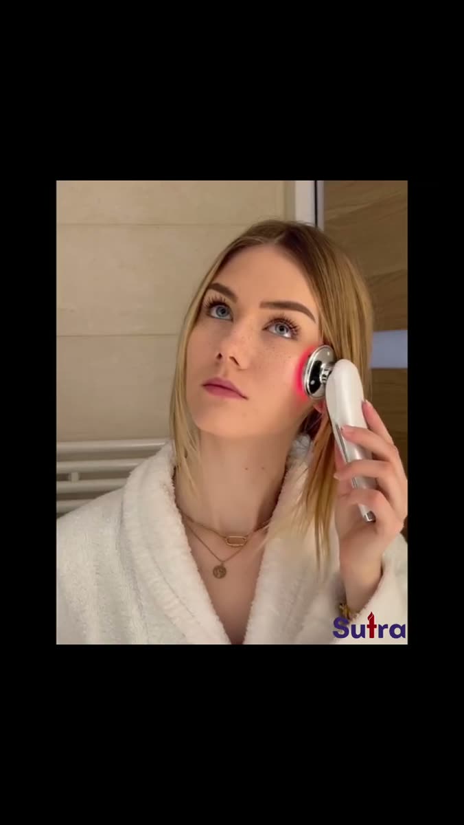
Seven alternatives, and what each one costs
Pick one, not all sevenEveryday sensation, not transformation
The most corroborated seam in our own corpus is not aspiration. It is ordinary sensation: smell, effort, temperature, the feel of something on skin, the two minutes the routine actually takes. Seven separate research files arrived there independently, which is more internal agreement than any other position we hold.
Transformation asks a stranger to believe you. Sensation asks her to remember something she already knows. The second one is free, and it does not need a study underneath it.
- Write the line you would say to a friend, not the line that would fit on the box
- Name the sensation, never the outcome
- If a claim needs a clinical study behind it, we will not put it in an ad at all
- What it costs
- Nothing. It is a writing decision made before anything is shot.
Move the camera, not the budget
The most inventive frame in a census of sixty-four creator videos was shot from inside a snack cupboard, looking out at the hand coming in. Same room, same person, same phone. The entire upgrade was position.
Beauty defaults to two camera positions: three-quarter product on a surface, and a face at eye level. There are twenty more available in any real bathroom, and all of them are free.
- Inside the cabinet, looking out at the hand
- On the counter at bottle height, so the person is a shape above the frame
- Over the shoulder into the mirror, where she is already looking
- Behind the glass of the shower door
- What it costs
- Twenty minutes, and a willingness to put a phone somewhere awkward.
Rawness belongs to the performance. Polish belongs to the object.
This is where the evidence looks contradictory and is not. One body of work says the least-produced files read as the most credible. Another says premium categories lose when the product itself looks cheap, because an ad that converts but looks cheap teaches the customer the brand is cheap. Both are true, because they describe different things.
So: handheld, unscripted, imperfectly framed, around a product photographed properly. The performance is allowed to be rough. The bottle is not.
- Hard light and a real macro lens on the product
- Phone, one take, no grade on the person
- Never the reverse: a glossy performer holding a badly lit product is the combination that reads as an ad
- What it costs
- One product photography session, reused across every cut afterwards.
Pin it to a cue that already exists
The most repeated mechanism in the creator work we studied is friction reduction plus implementation intention. In plain terms: attach the product to something already fixed in the viewer's day, so remembering it stops being work.
A result is a promise. A ritual is a place. Only one of those survives being fact-checked, and it is the one nobody in beauty shoots.
- Name the cue: the kettle, the alarm, the last thing before the light goes off
- Shoot the cue first and the product second
- Keep the same cue across the whole set so it becomes the brand's own hour
- What it costs
- One line in the brief, and the discipline to keep it for six months.
A mistake on camera is evidence
Dispense too much. Wipe it on the back of a hand. Put the cap down somewhere and lose it. None of that is flattering and all of it is proof that a person used the thing.
This is the alternative with the highest internal resistance and the one that most reliably separates your ad from the four beside it. It costs nothing to shoot and it is almost always the first thing killed in review.
- One mess per film, not three, or it becomes a bit
- Never a mess that makes the product look faulty
- The mess is about the person, never about the product
- What it costs
- An argument with whoever owns the brand guidelines.
Say what it will not do
Persuasion by refusal. Name the thing the product does not fix, out loud, inside the ad. Volunteering the limit buys credibility for everything on either side of it, and it is the cheapest trust available to a brand nobody has heard of.
It does structural work too. A refusal violates the category consensus, so it functions as a hook and as a claim in the same breath.
- Name the absence: no fragrance, no fix for texture, no result inside a week
- Aim the negative at the situation, never at the product or the buyer
- Say the limit before the benefit, not as a footnote after it
- What it costs
- One legal review. After that it is free forever.
Find the physical event the product is shaped like, then film that event literally
This is the most transferable hook device we own, and the cheapest one our corpus found was a prop: an ordinary object doing the wrong job. A four-compartment pill organizer filled with adhesive patches argues the whole format without a single sentence of copy.
Two guardrails travel with it. The metaphor has to describe something other than the product, because a metaphor pointed at the product turns into a claim. And it must not read as a diagram.
- Write it as a noun phrase describing a material behavior: a drop, a ripple, a sinking
- Shoot the event for real, at real scale
- If the viewer needs the voiceover to understand it, it is a diagram and it has failed
- What it costs
- One prop, and half a day of thinking before anything gets booked.
Notice what is missing from that list. No instruction to be surreal, no neon, no glitch, no ironic Y2K typeface. Those are the category's approved way of looking different, which means they are converging too, on a slower clock. Distinctiveness is a property of the argument and the point of view, not of the grade.
05The two-minute test
We once delivered ten static creatives that were technically clean and brand-native in every mechanical way. All ten scored 50 out of 100 against a bar of 85. The note was that we had taken an image and put text on it, that it was the easiest edit anyone could do, and that a client who thinks they can do it in two minutes will not pay thousands for it.
Photo plus typography became a banned output class for us that day, at any level of polish. What replaces it is composition assembly: deconstructions, ingredient arrangements, multi-element still lifes, a design system built rather than applied.
Four of ours, including the ones that are still the category default
Our own work, judged honestlyThe test is blunt and it works. Show the creative to somebody outside the room and ask whether they could rebuild it in two minutes with a phone and a free design tool. If the answer is yes, you bought a layout. The second-by-second construction of a fifteen-second ad is where the difference actually lives.
Run this on your own last three beauty ads
Tick as you go - it remembers06What does this still not prove?
That a distinctive beauty ad outperforms an interchangeable one. We do not have that data and, as far as we can find, nobody has a clean study attached to it either. What we have is a kill log, a stack of verdicts, and the pattern that fell out of them, which is a reason to look somewhere rather than a reason to expect a result.
The nearest external number cuts slightly against us. CreativeX, across roughly 822,000 observations, measured a 10% higher creative quality score buying about 2% off CPM. Real, and small. System1 reports only 1.5% of digital ads reaching a four-star rating against 10% on TV, which says most spending fails at the floor rather than at the ceiling.
Questions people actually ask
Open what you needWhy do all skincare ads look the same?
Because each one is briefed against the last approved one. The reference set is the category itself, the approval process rewards what has already been signed off, and the legal limits on what a beauty brand may claim push the risk into the picture, where the safe picture is the familiar one. Two other mechanisms compound it: a generator returns the likeliest image, which in a converged category is its average, and sameness lives between ads rather than inside any one of them, on axes a maker watching one file at a time cannot see.
How do I make a beauty ad that does not look like every other beauty ad?
Change the register, the camera position, or the subject. Speak about sensation rather than transformation, put the camera somewhere a camera does not normally go, or point it at the ritual instead of the result. One of those three is usually enough. Changing the grade, the font or the transitions is not, because those are the layers a viewer does not perceive as difference.
Are AI-generated beauty ads worse than filmed ones?
Not inherently, and the failure modes differ from what people expect. Generation is good at product coverage, environments and volume. It is biased toward the category average, and it breaks on physical events like pouring, spreading and skin contact. Used for the shots you cannot afford to film, around real product photography, it is fine. Used as the source of the idea, it returns the mean.
What is the cheapest way to make a beauty ad look different?
Move the camera. It is free, it takes twenty minutes, and it has the highest ratio of effect to cost we have found. Inside the cabinet looking out, at bottle height on the counter, over the shoulder into the mirror. Same product, same room, same phone, and an entirely different frame from anything else in the feed.
Should a beauty brand use UGC or produced video?
Both, split by register rather than by budget. Keep the performance raw and the object polished: handheld and unscripted around a product that has been photographed properly. The combination that fails is the inverse, a glossy performer holding a badly lit product, because it reads as an advertisement pretending to be a recommendation.
How many beauty ad concepts do I need before one works?
More concepts than you think, and fewer variations of each. Five variations of one idea is a single swing rendered five times, and it will live or die together. What moves results is the count of genuinely distinct swings, which is why we build a surplus and then cut it hard rather than iterating one direction toward acceptability.
The stone-and-droplet ad is not bad. It is competent and safe, which is exactly why it cannot work for you. Competence is the entry price in a category where a hundred brands clear it every morning, and the only frame worth paying for is the one your competitor could not have shot.
Where the numbers came from
- VidMob and TikTok. Hook analysis across 1,678 ads and 7.3 billion impressions - casting and direct-address effects
- Motion. Creative Benchmarks 2026: winners are rare - 550,000+ ads, 6,000+ advertisers, creative lifespan
- System1. Star Rating benchmarks for digital advertising - share of digital ads reaching a four-star rating
- CreativeX. Creative Quality Score - the size of the craft-floor effect
Every figure above links to the place it was published. Numbers marked as ours are measured inside this studio and we say so where they appear. We do not print a statistic we cannot point at.
Send a product link. Get one beauty ad back that is not the one above.
No call and no deck. One finished cut built from your own product, inside three days, yours to run whether or not we ever work together. If it contains a stone slab and a slow drop, you can tell us we did not follow our own rules.
Replies within a day. Ad within three.